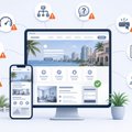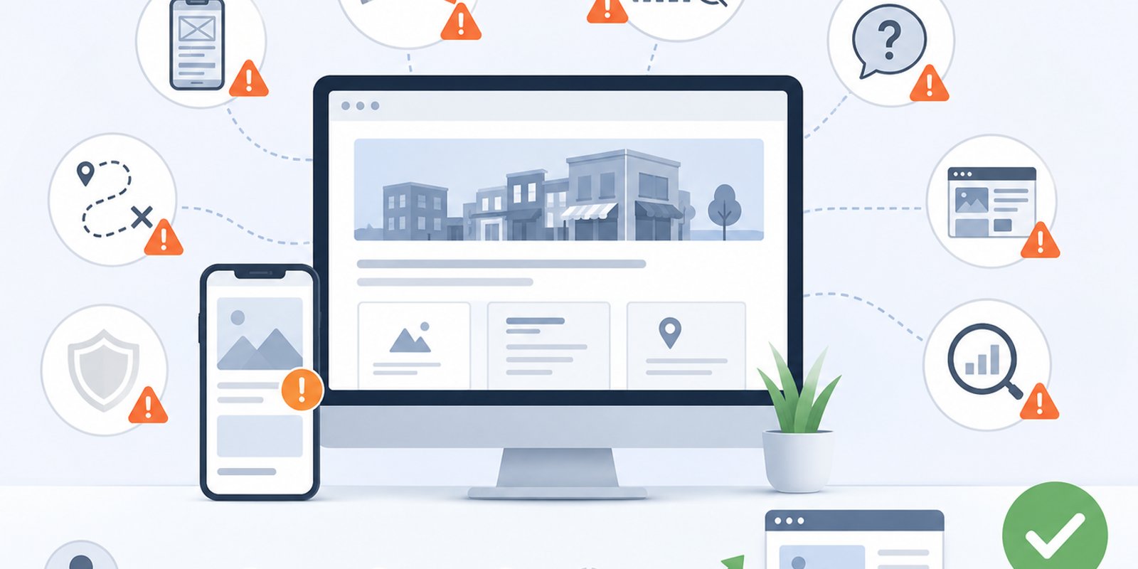

A business website can influence whether a visitor feels confident enough to call, book, request a quote, or move on to another provider. Many companies invest in a website expecting it to support growth, but small design and strategy mistakes can quietly reduce trust, visibility, and lead opportunities. For companies reviewing WEB DESIGN WEST PALM BEACH options, avoiding these mistakes can make the difference between a website that simply exists and a website that actively supports business goals.
In Wellington, West Palm Beach, and across Palm Beach County, customers often compare multiple businesses before making contact. A website that feels outdated, confusing, slow, or unclear can weaken a company’s first impression. Wellington Web Designs helps businesses create websites built around user experience, mobile responsiveness, local visibility, service clarity, and stronger paths toward customer inquiries.
Mistake 1: Designing for Looks Instead of Business Goals
A visually attractive website is important, but appearance alone is not enough. One of the most common mistakes businesses make is focusing heavily on colors, images, animations, or layout style without first defining what the website needs to accomplish.
A business website should be planned around practical goals. Does the company need more consultation requests? More calls? Better local visibility? Clearer service explanations? Stronger trust with prospects? These goals should shape the design decisions.
When a website is designed only to look modern, it may still fail to guide users. Visitors may admire the design but leave without understanding the services or knowing what step to take next. A better approach connects design with strategy. Every page should help users learn, trust, compare, and act.
Strong business-focused website design gives companies a clearer way to connect visual presentation with lead generation, user experience, and long-term digital visibility.
Mistake 2: Making the Homepage Too Vague
The homepage is often the first place visitors decide whether to stay or leave. If the homepage does not clearly explain what the business does, who it serves, and why it is credible, users may not continue browsing.
Vague homepage messaging usually includes broad phrases like “quality solutions,” “trusted professionals,” or “we help businesses grow” without specific details. These phrases may sound polished, but they do not give visitors enough information. A stronger homepage should quickly communicate the business’s main services, service area, value, and next step.
For local businesses in South Florida, the homepage should also make regional relevance clear without overloading the page with location terms. Visitors should quickly understand whether the company serves their area and whether the services match their needs.
A homepage should work like a clear introduction, not a puzzle. When users understand the business quickly, they are more likely to continue exploring.
Mistake 3: Ignoring Mobile Users
Mobile responsiveness is no longer optional. Many customers browse business websites from phones while comparing services, checking reviews, looking for contact information, or deciding whether to request help. If a website does not work well on mobile, the business may lose leads before visitors ever reach out.
Common mobile mistakes include small text, crowded buttons, slow-loading pages, hard-to-use menus, oversized images, and forms that are difficult to complete. These issues create frustration. Even if the desktop version looks professional, a poor mobile experience can damage trust.
A strong mobile experience should make the website easy to read, scroll, tap, and navigate. Contact buttons should be visible. Forms should be simple. Service pages should be easy to scan. Calls to action should not disappear on smaller screens.
Businesses that invest in mobile-responsive website design can create a smoother experience for visitors who are ready to take action from any device.
Mistake 4: Hiding the Call to Action
A website can have strong content and professional design but still lose leads if the next step is unclear. Calls to action should not be hidden at the bottom of a page or limited to one contact link in the navigation.
Visitors are often at different stages of decision-making. Some are ready to schedule a consultation. Others want to compare services, ask a question, or request more information. A website should include clear calls to action at natural points throughout the visitor journey.
Good calls to action are specific and helpful. Instead of generic language, they should match the action the business wants users to take. They should also be easy to see on desktop and mobile.
A clear call to action does not need to feel aggressive. It simply helps users understand what to do next. When the next step is obvious, the website becomes easier to use and more effective as a lead-generation tool.
Mistake 5: Using Weak or Generic Service Pages
Service pages are some of the most important pages on a business website. They help visitors understand what the company offers and help search engines understand the structure of the site. A common mistake is creating service pages that are too short, too generic, or too similar to one another.
A strong service page should explain the service clearly, describe common customer problems, outline the benefits, answer basic questions, and guide users toward action. It should also include enough detail to help visitors feel confident that the company understands their needs.
For example, a business serving Wellington, Royal Palm Beach, and nearby areas may need service pages that speak directly to local customers and their expectations. Generic pages can make the company feel less specialized, while detailed pages can support trust and relevance.
Effective lead-generation website structure helps organize service pages so they are useful for both users and search visibility.
Mistake 6: Forgetting About Website Speed
Website speed affects first impressions. A slow website can make visitors impatient and may cause them to leave before they read the content. It can also make the business feel outdated or less reliable, even if the company itself is professional and responsive.
Common causes of slow websites include large images, too many plugins, heavy scripts, weak hosting, unoptimized code, and unnecessary design effects. These issues can create a poor user experience, especially on mobile devices.
Speed should be considered during design and development, not only after the site launches. Images should be optimized, layouts should be efficient, and unnecessary features should be avoided. A fast site helps visitors move through pages more comfortably and makes it easier for them to reach contact points.
For businesses competing in the Florida business market, a faster website can support stronger usability and a better first impression.
Mistake 7: Not Building Trust Throughout the Site
Trust should not be limited to one testimonial section or one about page. It should appear throughout the website in ways that feel natural and useful. Visitors want to know whether the business is experienced, credible, responsive, and capable of solving their problem.
Trust signals may include customer reviews, case studies, project examples, credentials, service explanations, team information, process details, local experience, and clear contact information. These elements help reduce hesitation.
A website that does not include enough trust signals can feel incomplete. Visitors may still have questions about the company’s reliability or fit. Even if the business has a strong reputation offline, that reputation needs to be reflected online.
Trust-building design helps users feel more confident as they move through the site. It supports the decision-making process before the first phone call or form submission.
Mistake 8: Creating a Confusing Navigation Menu
Navigation should help users find information quickly. A confusing menu can make visitors feel lost, especially if services are poorly organized or important pages are buried.
Common navigation mistakes include too many menu items, unclear labels, missing service pages, dropdowns that are difficult to use, and contact pages that are hard to find. Navigation should be simple, logical, and based on how customers search for information.
A clear menu usually includes core service pages, an about page, contact page, and any important supporting pages. For larger websites, services may need to be grouped in a way that makes sense to users. The goal is to reduce friction and help visitors move naturally through the site.
Good navigation supports both user experience and SEO-friendly structure. It helps people and search engines understand what the website offers.
Mistake 9: Treating SEO as an Afterthought
Some businesses design a website first and think about SEO later. This can create problems because SEO-friendly structure should be part of the planning process. If pages are not organized correctly from the beginning, the site may need revisions after launch.
SEO-friendly design includes clear headings, focused service pages, optimized page titles, clean internal linking, helpful content, local relevance, image optimization, and strong technical structure. These elements help search engines understand the website and help visitors navigate the content.
The goal is not to force keywords everywhere. The goal is to build a useful website that clearly explains the business and supports customer intent. A site that is easy to understand often performs better for both users and search visibility.
For local businesses, SEO should support the same goals as design: clarity, relevance, trust, and action.
Mistake 10: Launching Without a Clear Review Process
A website should be reviewed before launch for usability, mobile performance, content accuracy, contact forms, speed, links, and page flow. Launching without review can lead to missed errors that affect trust and functionality.
Common launch issues include broken links, forms that do not send properly, missing page titles, inconsistent formatting, spelling errors, slow mobile pages, and unclear calls to action. These issues may seem small, but they can affect how users experience the website.
A proper review process helps ensure the site is ready for real customers. It also allows the business to confirm that the website reflects current services, locations, branding, and contact details.
A strong launch is not just about publishing the site. It is about making sure the website is ready to support the business from day one.
How to Avoid These Website Design Mistakes
Avoiding website design mistakes starts with planning. A business should define the website’s purpose before choosing layouts, visuals, or features. The site should be built around the customer journey, not just company preferences.
A stronger website plan should answer:
- What does the visitor need to understand first?
- Which services need their own pages?
- Where should calls to action appear?
- What trust signals should be included?
- How should the mobile experience work?
- What local relevance needs to be communicated?
- How will the site support SEO and future growth?
When these questions are answered early, the website becomes more focused. It can support users more effectively and help the business avoid costly revisions later.
Avoid Website Mistakes That Limit Local Leads
For companies in Wellington, Palm Beach County, and the surrounding South Florida market, avoiding common website design mistakes can help create a stronger first impression and a clearer path toward customer inquiries. A better website should be easy to use, mobile-friendly, locally relevant, and built around business goals.
Schedule a Free Consultation to improve your local business website
FAQ
What is the biggest mistake businesses make with website design?
One of the biggest website design mistakes is focusing on appearance without connecting the design to business goals. A website should look professional, but it should also guide users clearly, explain services, build trust, and make the next step easy.
Why do calls to action matter on a business website?
Calls to action matter because they show visitors what to do next. If contact buttons, forms, or consultation prompts are hard to find, users may leave even if they are interested. Clear calls to action help reduce friction and support lead generation.
How can a website improve local business visibility?
A website can improve local business visibility through clear service pages, local relevance, SEO-friendly structure, optimized headings, useful content, and a strong mobile experience. These elements help both users and search engines understand the business.
What website design mistakes should Wellington businesses avoid?
Wellington businesses should avoid vague messaging, poor mobile usability, slow pages, hidden calls to action, weak service pages, confusing navigation, and missing trust signals. These issues can reduce customer confidence and limit inquiries.